Bombay CLUB Conceptual Visual: Fortune Wheel Design
Conceptual Visual: Fortune Wheel Design
Design a mockup of a Fortune Wheel that could be used in our promotions (online or in-venue). We’re not looking for high-detail polish but for strong creative direction and visual identity.
Requirements: Create a wheel layout (8 to 12 slices) that fits our luxury aesthetic. Visually present potential prizes in the slices (e.g., wallet bonuses, drinks, spins, upgrades). Use color palettes, typography, and layout aligned with Bombay brand (dark tones, metallics, jewel tones, minimalism over clutter)
Optional: Include a short explanation of creative choices (color use, layout, type)
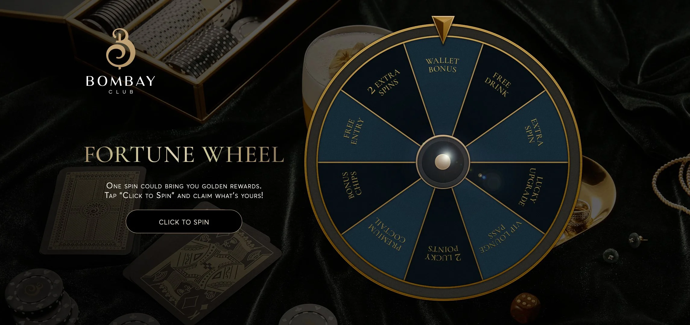
“I based it on the surface and texture of a poker table. Next, we can use different colors instead of light blue, shifting toward emerald or burgundy tones for different campaigns. The background images can also be changed depending on the company’s situation. Depending on the color scheme, the metal color can be adjusted to match the palette.”
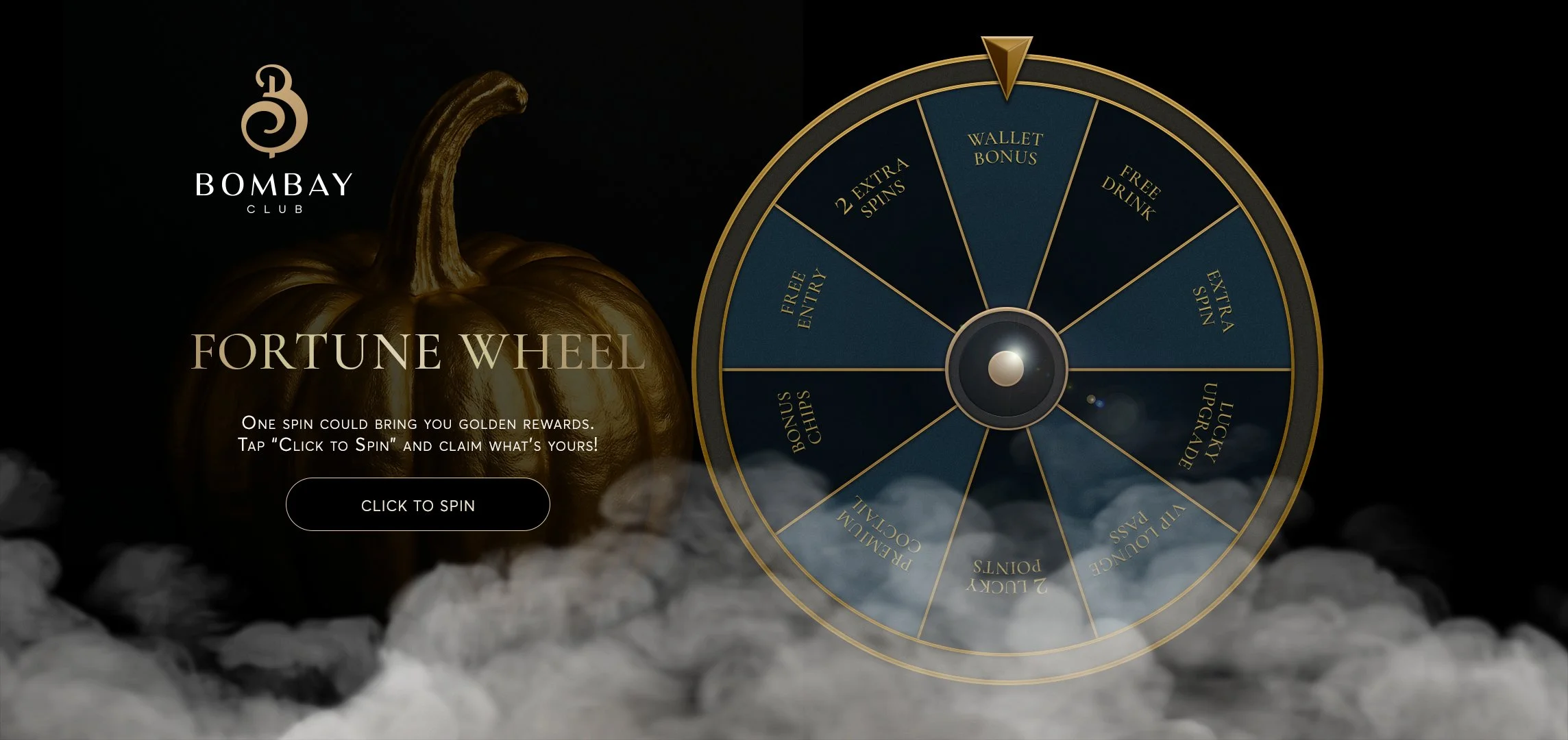
“I also tried a version for permanent events. Since Halloween is coming soon, I decided to create another version based on this concept. For all other variations, it will be possible to change the background image, the color of the blue slots, and the metal styling — from gold to platinum, silver, and so on.”
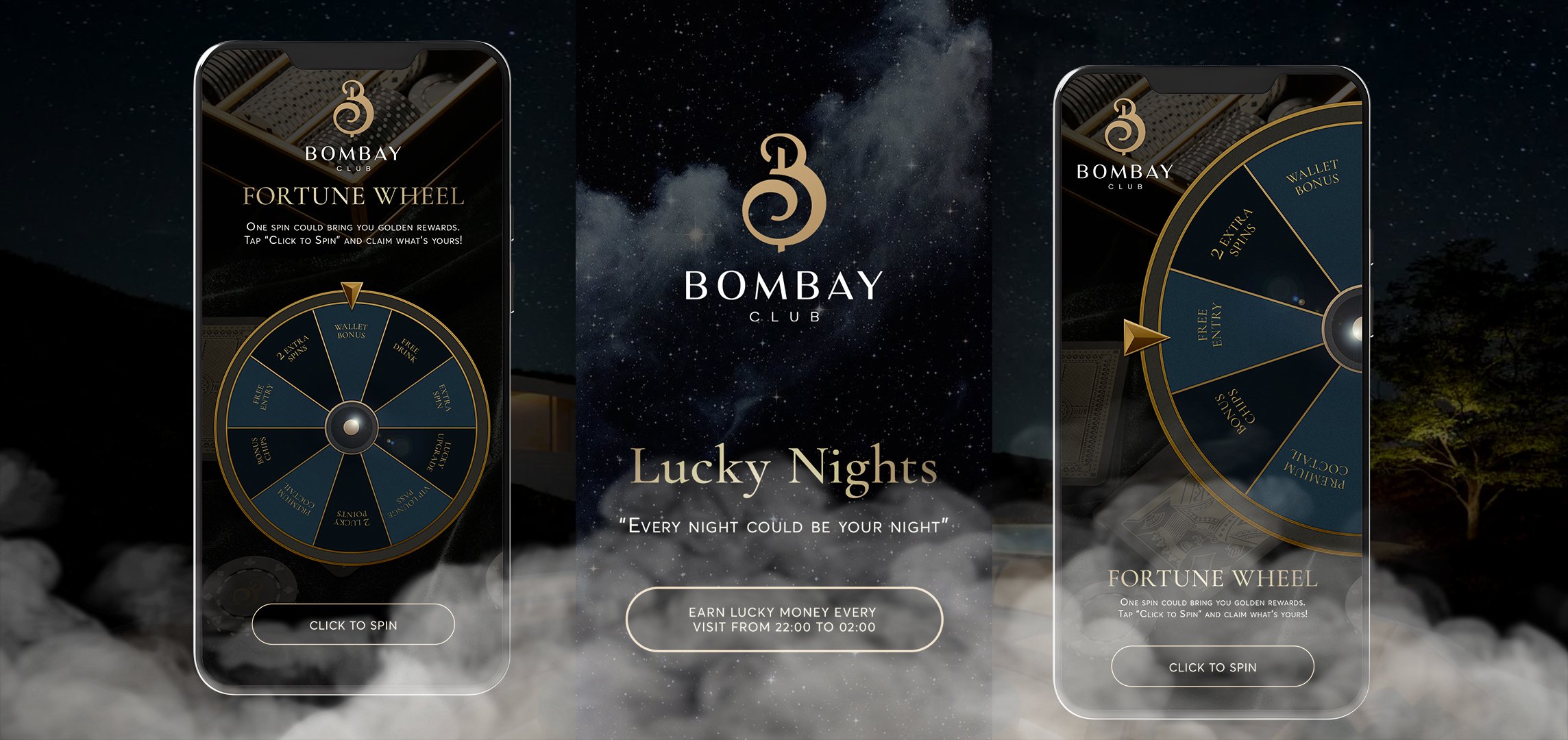
I also reviewed the mobile version in advance. Since a large number of users have long been using smartphones for quick interactions, it’s very important to keep in mind from the start that this sector needs to be considered from a usability perspective. During the design process, I discovered that there’s a risk of the screen size being insufficient, and people with poor eyesight might find it uncomfortable to read the text — so I created an alternative version of the mobile layout.
Zestly “Data Harvest” Landing Page
UX & Web Design Challenge — 8h Concept by Jaan Weber
Zestly transforms scattered retail data into fresh insights that help small and mid-market retailers act with clarity and confidence. This landing page was designed to introduce their autumn campaign — Data Harvest — and drive demo sign-ups.
Problem: Retailers struggle with fragmented data sources and lack of actionable insights.
Goal: Create a conversion-focused landing page that communicates freshness, clarity, and trust.
Audience: Retail decision-makers (30–50 y.o.)
Insight quote: “I don’t need more data — I need clarity I can act on.”
Zestly “Data Harvest” Desktop Landing Page preview
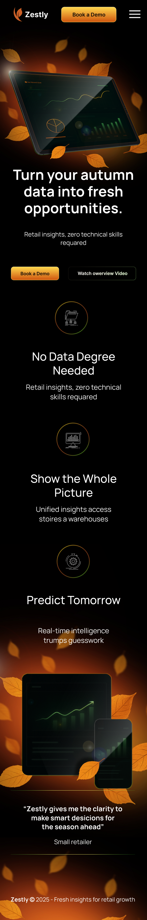
Zestly “Data Harvest” Mobile Landing Page preview
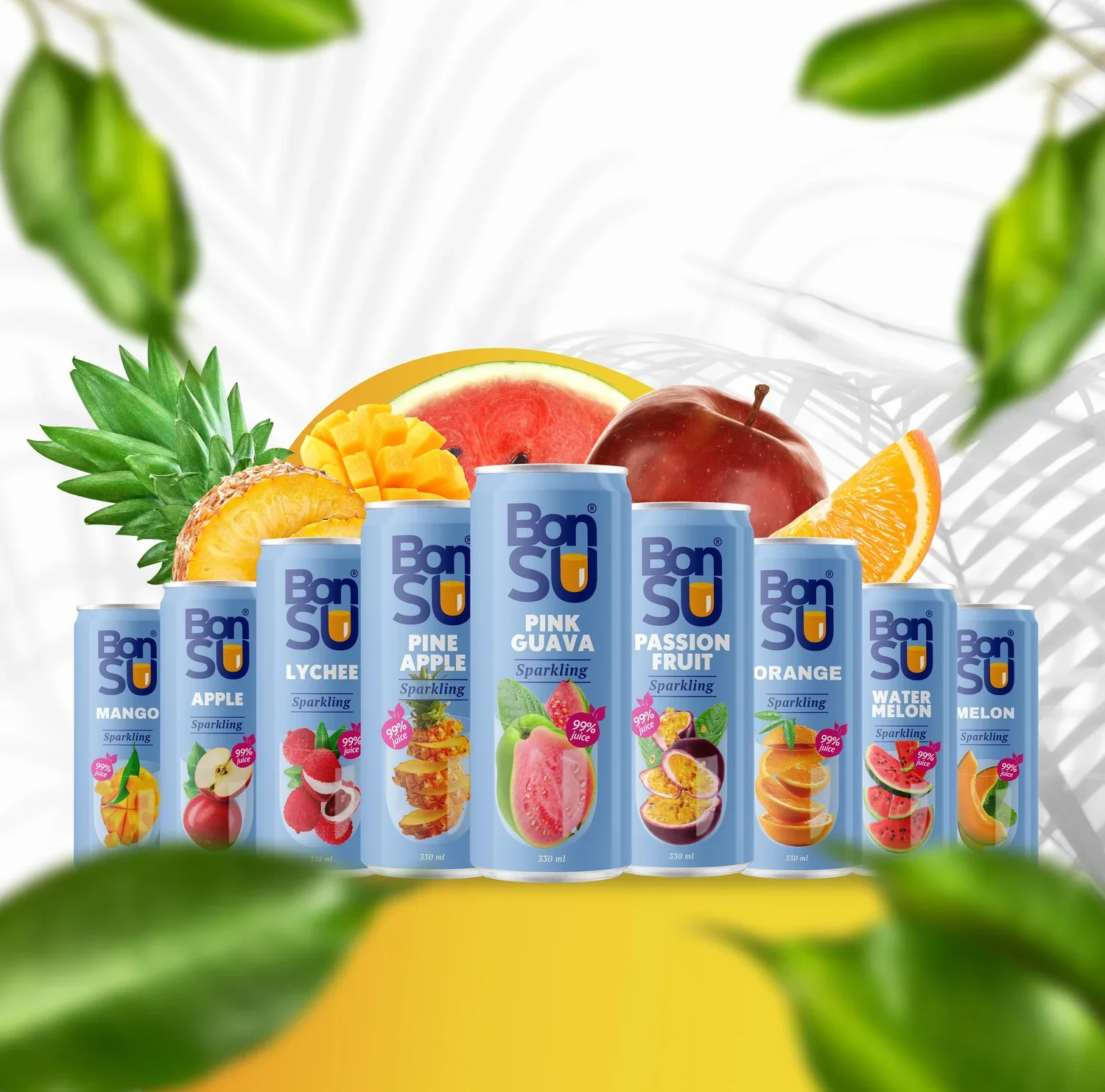
BonSU "Product Design” Solution
Problem: How can we transform the product into something truly unique and instantly recognizable on crowded store shelves?
Goal: Ensure the product captures attention the moment consumers approach the aisle.
Audience: Men and women of all ages.
Solution: After analyzing the local market and conducting on-site research abroad, we identified a clear opportunity: a clean, minimalist design supported by a refined color palette and a strong, focal composition. This visual strategy allows the product to stand out immediately among competitors.
For carbonated drinks, we introduced a neutral light-blue background to create a fresh, airy feel. For coconut water beverages, we used a green background to emphasize naturalness and support future product line expansion. Together, both lines form a cohesive visual system that feels balanced, modern, and non-competitive — making the entire brand instantly more memorable on the shelf.


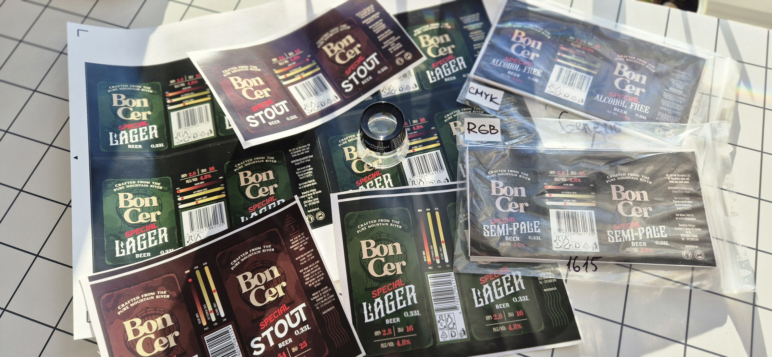
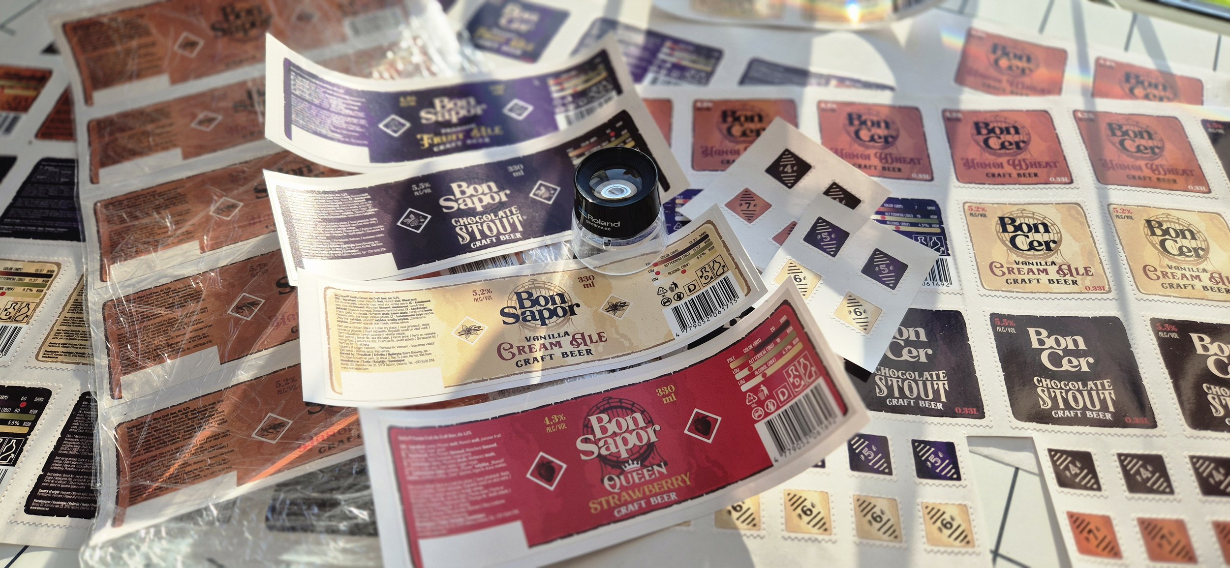
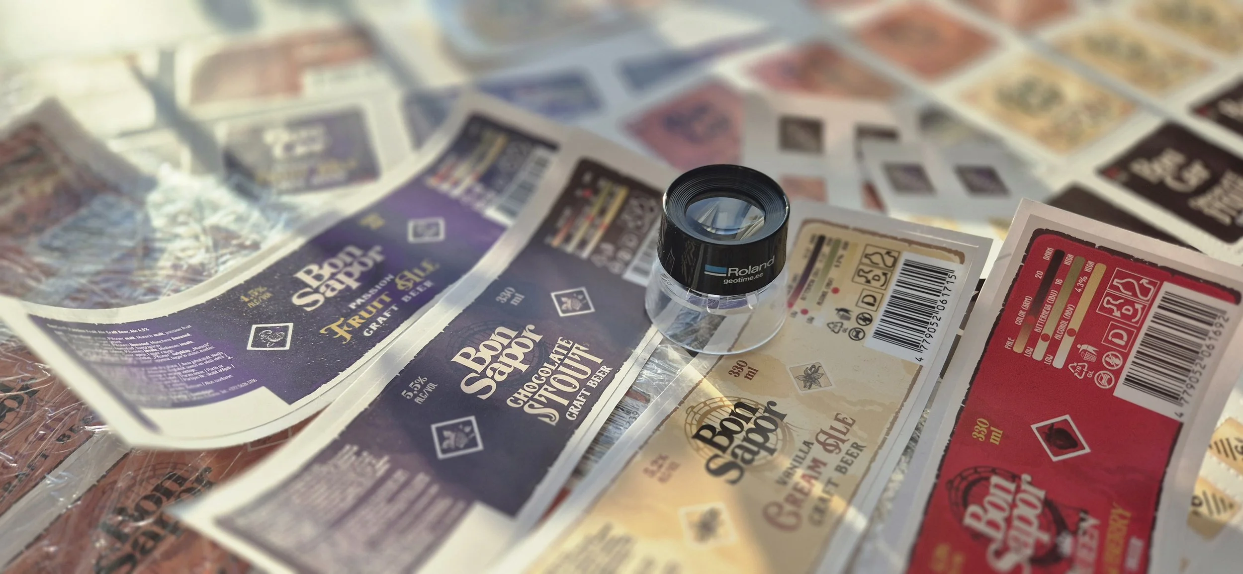
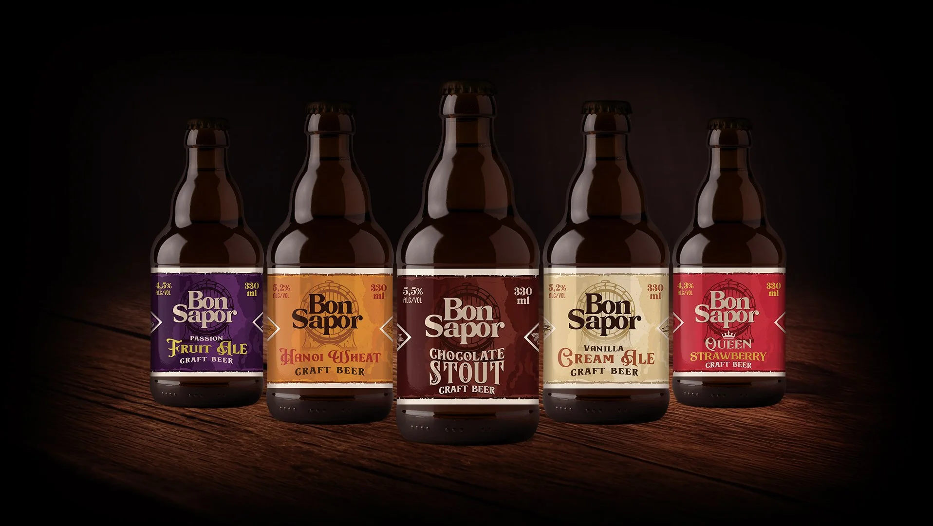
Bon SAPOR "Beer Label Design”
Probably one of the most exciting experiences I’ve had in building an alcohol beer brand. Over the course of six months, we carried out an in-depth analysis of the brand and its competitors, followed by extensive prototyping and testing. The story began with just two beer varieties, while intentionally laying the foundation for many future flavors.
Throughout the design process, both the brand name and the bottle design evolved. We didn’t limit ourselves to digital mockups—real physical prototypes were also created and presented to focus groups for feedback.
The goal was clear: to create a beer brand that appeals not only to men but also to women; a product that stands out on crowded shelves and works equally well as a single SKU or as part of a multi-flavor lineup.
One of the concepts explored was a numbered system for the product line. However, we needed to reserve numbers 1 through 3 for limited-edition releases. This created an interesting challenge: beer enthusiasts would naturally wonder where the first flavors—the origins of the brand story—could be found.